Four Vital Signs of SaaS


SaaS metrics should be to a management team what patient vital signs are to an emergency room doctor: a simple set of universally understood numbers that allow a doctor to quickly know how ill a patient is and what needs fixing first.
Heart rate, blood pressure, respiratory rate, and temperature are the big four vital signs in the ER. Everyone knows what they are, what they mean, and what good and bad looks like. When a patient is wheeled in, the doctor does not start by asking the EMT, “How exactly are we defining heart rate?” This shared understanding allows for rapid evaluation then fast, focused action.
Not so much in SaaS, where discussions about definitions are all you hear. There are too many metrics, too many things to measure, and too many useful but incompatible ways to measure them. This results in a loss of clarity, comprehension, and—most importantly—comparability across different companies.
At Scale we’ve spent the last twenty years evaluating investments in SaaS and other subscription companies. We have built an internal shared belief of what the Four Vital Signs of SaaS are, and how exactly to measure them. We have opted for simplicity over complexity in selecting these metrics. This has allowed us to benchmark accurately across companies and to know what a realistic version of “good” looks like.
Scale recently launched Scale Studio, an open-to-anyone tool that gives cloud and SaaS companies performance benchmarks based on these vital signs and 20 years of data across more than 300 companies.
The Four Vital Signs of SaaS
The Vital Signs of SaaS are Revenue Growth, Sales Efficiency, Revenue Churn, and Cash Burn. Almost everything that matters about the financial performance of a SaaS business is captured in these four metrics.
Revenue Growth matters because growth is the central purpose of a startup and thus for an investor the most important driver of IF value can be created at all. We have found that at each stage of a company’s development there is a minimum required level of growth below which a startup will struggle to attract venture capital. We’ve analyzed this Mendoza Line for SaaS growth previously.
Sales Efficiency matters because software at scale is all about distribution, and thus the relationship between dollars invested in sales and marketing and dollars back via revenue is the key determinant of HOW MUCH value is created per dollar invested. In a perfect world I would call this Distribution Efficiency, because calling it Sales Efficiency tends wrongly to narrow the focus on this metric to just sales, but that ship has sailed.
Revenue Churn matters because as growth slows the impact of churn escalates and provides an upper bound on HOW BIG a company can become. More fundamentally, high churn is just the financial evidence of a product that is not delivering value to customers. Products that do not deliver value cannot build value for their investors, which is why my former Board colleague at Box, Mamoon Hamid, is right in saying that every company needs a non-financial north star.
And of course, Cash Burn matters because, well, DUH. Try running a company without it.
Measuring and Benchmarking the Four Vital Signs of SaaS
Vital Sign #1: Revenue Growth
There are multiple ways to measure revenue and thus Revenue Growth. ARR-based metrics are more forward looking but GAAP revenue tends to be calculated more accurately and is thus more comparable across companies. It typically lags ARR by about a quarter and for simplicity we have not excluded services revenue. The simplest measure of Revenue Growth is the quarterly GAAP revenue run rate compared to the same quarter GAAP revenue one year ago (or a year from now for a forward growth estimate). We also measure revenue growth using the ARR Growth Rate and a forward-looking measure of ARR growth that we call iCAGR.
We benchmark Revenue Growth by looking at companies at a comparable revenue run rate because revenue growth rates decline fairly predictably as absolute revenue scale increases (as is clear in the chart below). This means that the top quartile Revenue Growth rate of 123% at a $20M revenue run rate would represent bottom quartile growth at a $2M revenue run rate.
The chart and table below show, for various revenue run rates, what revenue growth rates represent top, median, and bottom quartile performance. The Scale Studio dataset has 300+ public and private SaaS companies, some of which have become public, many of which have not, and most of which have raised at least some venture capital.

Using this table, a team can quickly benchmark their company’s performance. For example, a company that grew last year 80% from $11M to $20M is growing at just above 50th percentile growth for SaaS companies at that stage, which is 78%.
It is also interesting to see that the data here broadly agrees with a separate calculation we did recently around the Mendoza Line for SaaS growth that tracks at or just above the bottom quartile of growth rates. The Mendoza Line was derived by math, the table above was generated from real data, and it is good to see both estimates roughly agree.
We can also generate a separate table showing the same revenue growth benchmark data on a forward basis, to allow a company to answer the related question: If I am at a $20M run rate now, and I grow next year at 50%, how will I be doing relative to other SaaS companies? Here are the benchmark chart and data table for Forward Revenue Growth.

Another way to look at the same data is to think about the revenue trajectory over time, or “how many years to $100M”. The graph and table below show for a consistent top, median, or bottom quartile company (at the cutoff points) how long it takes to grow from $1M to $100M. A company that grows consistently, just at the top quartile cutoff growth rate, takes six years to get to a $100M run rate, a median performer takes eight years, and a bottom quartile performer does not yet get there in ten years. This is a calculation with all sorts of survivorship bias problems, because the slow growth companies tend to get acquired and not make it all the way to $100M, but the analysis is roughly right.
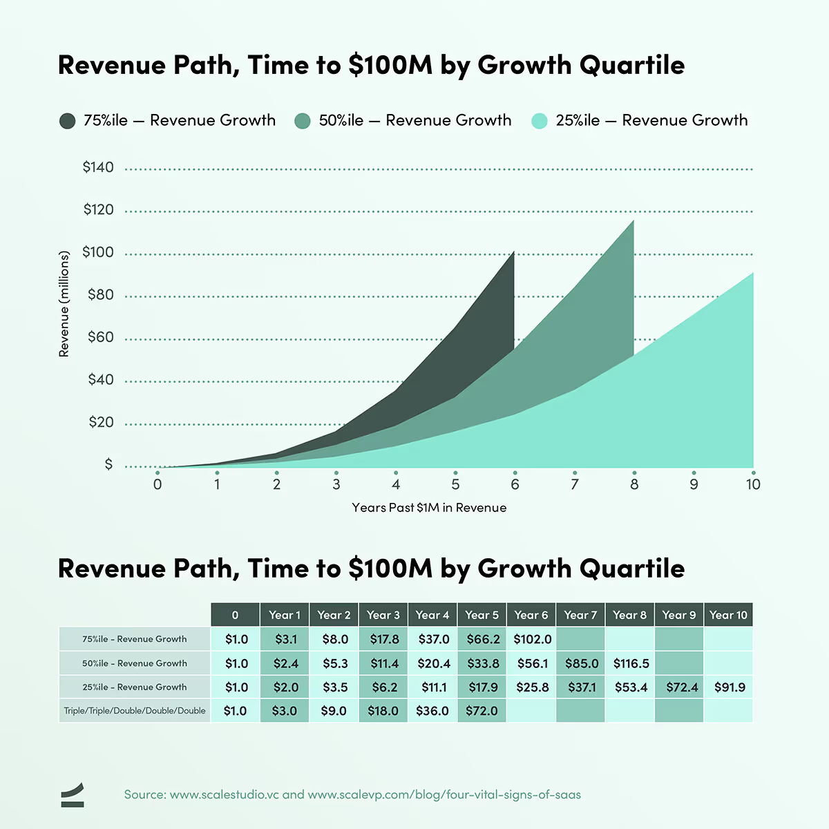
This data also matches well to various rules of thumb. An example is the T2D3 (triple-triple-double-double-double) rule, which is also shown in the table above. T2D3 matches top quartile performance for the first four years and becomes just a little aspirational in year five. If you fail to double from year four to year five and only grow at 90%, we would still be glad to talk to you! The data also roughly matches the Bessemer State of the Cloud Report, which shows an estimate of times to $100M for best-in-class companies.
Vital Sign #2: Sales Efficiency
Sales Efficiency metrics (and again the reminder to think of this more broadly as Distribution Efficiency!) measure the relationship between dollars in (spent on Sales and Marketing) and dollars out (in the form of new revenue). For a recurring revenue business, by far the most intuitive way to measure this concept is by dividing the Gross or Net New ARR for the quarter by the fully-loaded Sales & Marketing spend for the same quarter. The Gross SE metric measures the effectiveness of the company in generating new ARR, and the Net SE metric measures the overall effectiveness of the business in both generating and retaining revenue.
We love the simplicity of this calculation and its direct actionability. It can be explained in 30 seconds at a Sales Kick Off meeting in a way that no other measure can. “We gave you this money, you gave us this ARR”. We are not a fan of putting lags in this method (comparing this quarter’s Net New ARR with last quarter’s S&M spend). There is some logic to the idea that there is lag between spend and results, but once you start to adjust, you end up with all sorts of special pleading. Keep it simple.
For a Vital Signs diagnosis, we prefer this metric to the complexity of the LTV/CAC calculation. An LTV to CAC works really well for consumer businesses and for B2B businesses that have fairly consistent deal size and low net churn. A former Scale portfolio company, HubSpot, did a brilliant job of orienting their business around this metric. However, for enterprise businesses with highly variable deal sizes and strong positive net cohort growth over time, the calculation becomes arbitrary. The underlying idea is real, namely that enterprise customers can have lower Gross SE but higher ultimate value as the cohorts grow, but trying to track and explain quarterly fluctuations is hard.
Another complexity we choose to avoid is using Gross Margin instead of Revenue. It is of course more correct to use Gross Margin, but especially at the early stages of a SaaS company, Gross Margin fluctuates based on fixed cost recovery issues that significantly distort the calculation.
The problem with an ARR-based Sales Efficiency metric is it doesn’t allow easy comparison across companies. ARR is not reported by public companies and private company ARR numbers are often suspect. Our workaround was to slightly tweak the calculation for Net SE, replacing the numerator (Net New ARR) with the intra-quarter difference in GAAP revenue multiplied by 4 (annualized). We call this formula using GAAP instead of ARR the Magic Number and it should be equal to Net Sales Efficiency with a one quarter lag (to allow ARR to convert to GAAP).
As a rule of thumb: when you’re talking to your team and want to keep it simple, talk Gross and Net Sales Efficiency; when you want to do benchmarking against other companies, use Magic Number.

The benchmarking results here are very different. Unlike Revenue Growth, which clearly declines as absolute revenue increases, we have found Sales Efficiency to be fairly consistent across the entire SaaS universe. The median Magic Number for our dataset is between 0.8x and 0.7x, and the range from top quartile to bottom quartile is between 0.5x and 1.5x. This matches the public company dataset where the median is 0.7x today.
Payback (on a revenue not a gross margin basis) is simply the inverse of this number, which implies that the average SaaS company is earning back in revenue what it spends in sales and marketing in one divided by 0.7 years—17 months—with a top/bottom quartile range of 8 months to 2 years.
We have also observed something that does not come in this table, which is that Sales Efficiency tends to be persistent over time for a given company, especially after $10M. A good go-to-market model at a $10M run rate tends to still be a good model at $100M. And bad sales efficiency at $10M is hard to change later.
The high top-quartile Magic Number for the $1M revenue run rate represents an anomaly early on as often founders are doing the selling themselves (and probably not allocating their costs to Sales and Marketing!). Pretty quickly top quartile Magic Number falls to 1.4x and then to 1.0x at scale.
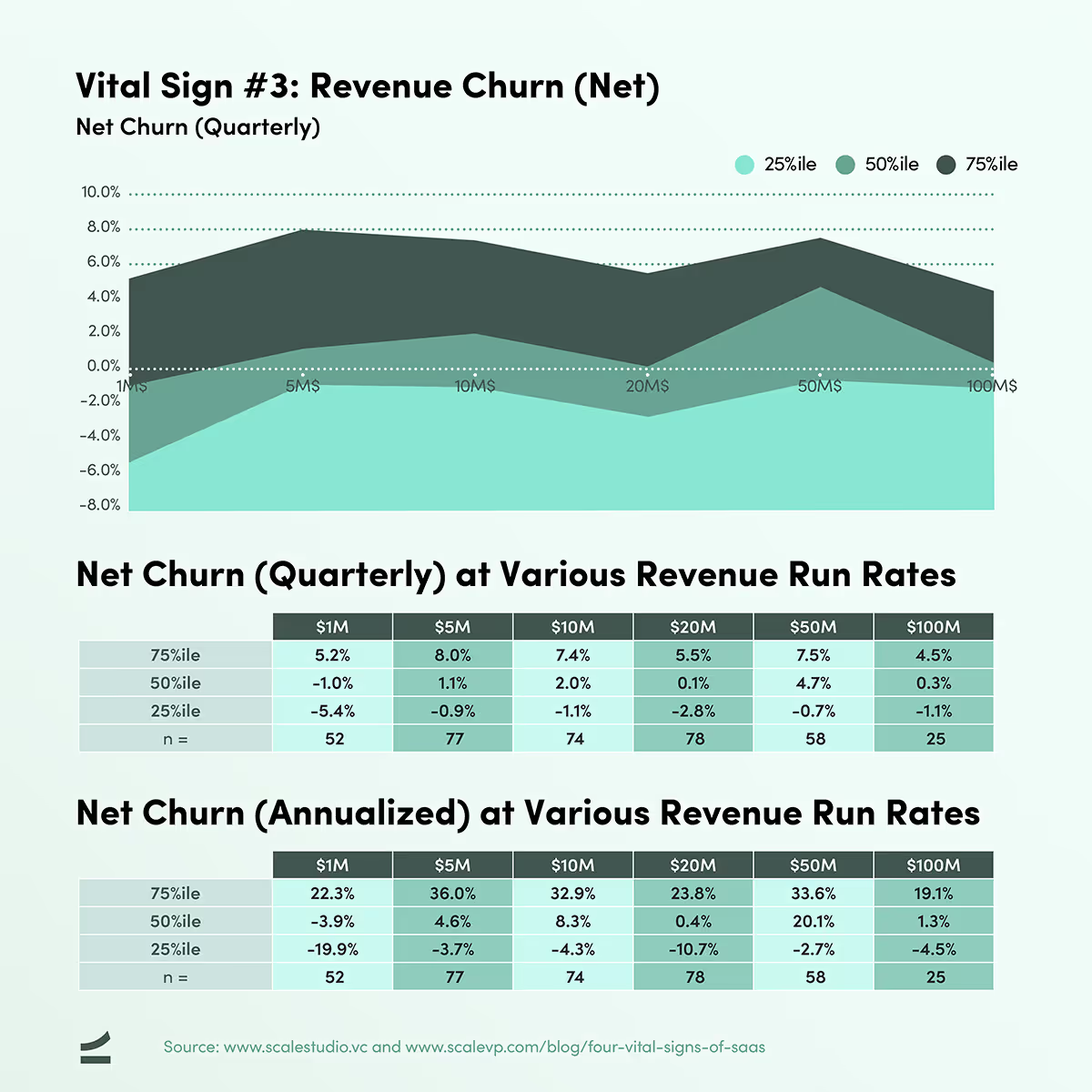
Vital Sign #3: Revenue Churn
The simplest way to measure Gross and Net Churn is by taking Churned ARR (Gross) and Churned less Upsell ARR (Net) and dividing it by opening ARR for the period, usually a quarter. In the tables below, we show Gross Churn by quarter and annualized. At the bottom of this section are benchmarks for Net Churn (quarterly and annualized) as well.
We acknowledge that this metric is a horrible oversimplification. For the Sales Efficiency calculation above, the simple method is also, we believe, the best method, but for the churn calculation this simplification comes at a significant cost in terms of being able to diagnosis underlying issues. At high growth rates especially, this measure understates actual churn. However, the Vital Signs framework calls for simplicity to allow consistent, relevant benchmarking across companies. If this simple benchmarking exercise exposes a churn problem, then a deeper dive using retention analysis and a cohort analysis is an absolutely required next step.

The data above shows Darwinian selection at work. Early on some companies have huge churn but they have to either improve or die. At a $20M revenue run rate even bottom quartile companies have annualized Gross Churn hovering around -21%.
And finally, here are the benchmarks for Net Churn on a quarterly and annualized basis.
Vital Sign #4: Cash Burn / Operating Income
Internally, we measure cash burn by looking at free cash flow for a quarter (operating cashflow less capex) and compare it to cash on the balance sheet, to calculate a cash out date. For confidentiality reasons, we do not ask for cash balances in Scale Studio. A reasonable proxy for cash burn is Operating Income, and the chart and table below show Operating Income as a % of Revenue at different revenue run rates.
To illustrate what this metric means, at a $20M revenue run rate the median company in the dataset is losing 63% of revenue, $12.7M dollars, or colloquially “burning $1M a month”. In Scale Studio you can also further benchmark total operating expenses one level down, across each of Gross Margin, Sales/Marketing, R&D, and G&A.
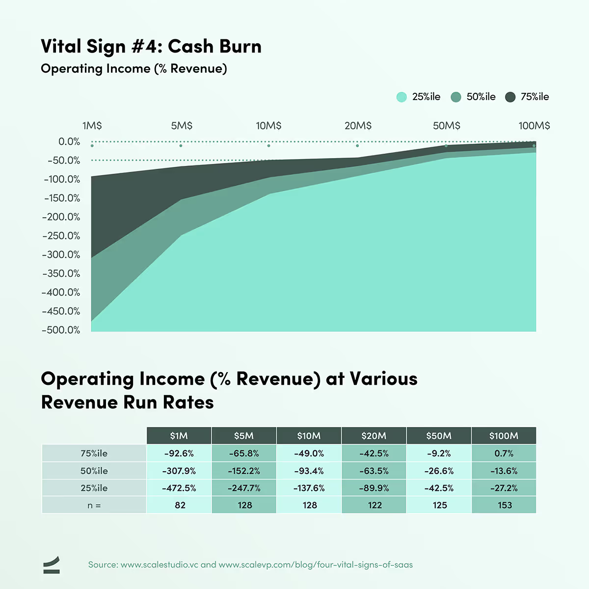
The most important point to make about this metric is that in a recurring revenue business, operating income, or “burn”, however calculated is not a measure of efficiency. Instead it is a measure of how aggressively a company is investing. A high operating loss coupled with a high growth rate and high sales efficiency is an aggressive but probably sensible strategy provided of course the company has access to capital. A high burn, low growth company is a disaster in the making.
Exactly how much burn for exactly how much growth will be the subject for another post but any comment that tries to link burn rate to value creation, without taking growth rate into account, is simply wrong. Many of the most successful SaaS companies were in the bottom quartile on this metric at $100M in run rate revenue but were also in the top quartile on revenue growth. Worth highlighting again is the proviso regarding access to capital. If the cash runs out even the best business dies.
The very best companies are those such as Veeva and Atlassian where a high Sales Efficiency allowed them to simultaneously be top quartile on growth, and top quartile on operating income profitability. It is no accident that companies with these characteristics get premium public valuations.
What are your company’s Vital Signs?
Getting started with Scale Studio is simple: you enter 9 basic data points for each of your trailing eight quarters then generate a benchmark report. The benchmarks use a sample set consisting of companies at the same revenue stage as yours. This allows for much more accurate benchmarking, especially for Revenue Growth and Operating Income which, as we have said, are a direct function of revenue run rate. The benchmarks give you a sense of your performance that is clear, concise, and comparable. Your report might say something like:
“At your current revenue run rate of $5M, your Y/Y Revenue Growth rate of 150% is in the second quartile for companies of your size, your Magic Number of 0.8 is in the second quartile, your Gross Churn of -1% is in the top quartile, and your Operating Income of -152% of revenue is in the second quartile.”
Vital signs don’t cure patients, doctors do. SaaS vital signs don’t fix companies, management teams do. But realistic benchmarking metrics do what ER vital signs do: pinpoint issues, provide actionable context, and allow you to get to work.
Jeremy Kaufmann contributed to this article. A version of the Four Vital Signs also appeared on TechCrunch.
At the top of the page: Scale partner Rory O’Driscoll presentation at the 2019 Startup Grind conference where he discussed the Vital Signs framework.
News from the Scale portfolio and firm